
All right, it is time to dive into all of the new branding that the Washington Commanders unveiled on February 2, 2022. The Commies rolled out a new Washington Commanders logo, a new Washington Commanders crest, and a new Washington Commanders wordmark. I purposely waited a couple of days to let all of this new branding marinate in my brain. I know the “hot take” is what the internet is all about. But, most hot takes are half-baked and largely driven by irrational emotion. Instead, I wanted to let my brain have a few days to consume and digest all of this overwhelming amount of new branding that we got in such a short amount of time.
As I review the new Commanders wordmark, logo, and crest, I purposely avoided looking at the team’s design element descriptions. So, we will start with the designs themselves and get my impressions. Then we will look at the team’s design element descriptions and see if those descriptions make any sense or not.
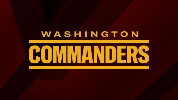
Washington Commanders Wordmark

Welp. There it is. It’s a word mark. Honestly, word marks are not the sexiest part of any new branding. Having said that, I like the word mark. The font has a strong military look to it. The lines above and underneath the word “Commanders” evokes the style of a name tag on military fatigues. I like the cut lines on the “C” and the “S” in the word mark. All in all, this is a good look.
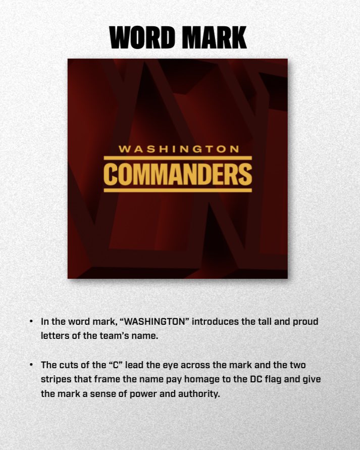
All right, what did the team’s design explanation say? Hmmm, the letters are tall and proud. Ummmm…okay. If you say so. Ah, the cuts on the “C” are supposed to lead the eye across the mark. Not sure if it does that, but I did say that I liked the look of it!
Damn! I totally missed the stripes that frame the word “Commanders” are supposed to pay homage to the two stripes in the DC flag. Okay, fine. That is as good an explanation as any.
Final Score: 9 out of 10
Next up is new Washington Commanders primary logo!

Oh, boy. Things sure got spicy right from the start with the new Commanders’ primary logo. Social media sure had little positive to say about this new logo. I read a wide range of criticisms. It looks like a slightly modified version of the Football Team “W” logo! It is uncreative and boring! It looks like a lame Microsoft clip art! It looks like a taco holder! I think the last criticism is actually a compliment. I love tacos and who wouldn’t want a taco holder as a logo?
Other complaints centered on the Commanders’ decision to use a “W” as their primary logo rather than having a unique Commanders logo. Something like a stylized “C?” Maybe a hog with an army helmet? A hog with an army helmet driving a tank? Who knows what people wanted for a unique Commanders’ logo? What we do know is that many people did not want a “W” for a logo or any letter for a logo.
I am fine with the new Washington Commanders “W” primary logo. I was one of the few people who wanted the new name of the Washington franchise to be F.C. Washington or Washington F.C. I always wanted the new name and branding to be focused more on the Washington part of the name rather than the nickname part of the name. By focusing on Washington first I felt that the new branding would better connect with Washington’s storied history.
So, for that reason, I was glad that the new primary logo is a “W” for Washington. Now, I will concede that the downside to using a “W” for a logo is that there are a ton of “W” logos already out there. So, the Commanders had to try hard to come up with something different. Also, the letter “W” is just a tough letter to make a logo. At any rate, I have no problem with a simple logo. They are usually effective.
Washington Commanders Logo
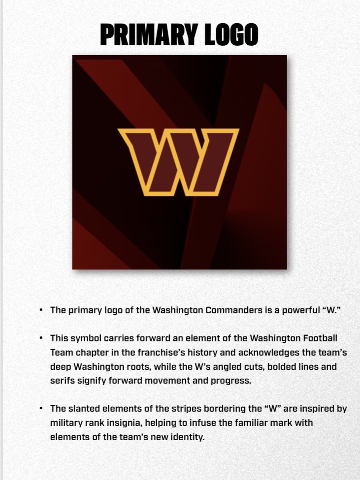
In the Washington Commanders’ press material, they state that the “W” logo is strong. Well….it is big and wide so…strong it is? The team also says that the design of the logo signifies forward movement and progress. That is hilarious! I love these silly explanations for logos and uniforms! Who believes this silliness? I guess the logo looks like it is moving based on the design of the top ends of the “W” logo.
Lastly, the team says that the slanted elements of the stripes bordering the “W” are inspired by military rank insignia. Okay, I can see that. The problem with using military design for your logo is that military design has never been confused with refined or artistic design taste. The result is a “W” logo that is going to look a bit dull and utilitarian because it is so militaristic.
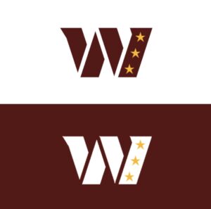
Now, while I am perfectly fine with the new primary logo, I will admit that I saw a tweaked version of the new primary logo on Twitter that the Washington Commanders should think about adopting. This logo was found on Reddit. The addition of the three stars representing the D.C. flag is excellent and helps to liven up a rather conventional-looking logo. However, I would keep the yellow outline on the “W.” The logo from Reddit looks too odd without the yellow outline.
Final Grade: 5 out of 10
Washington Commanders Crest
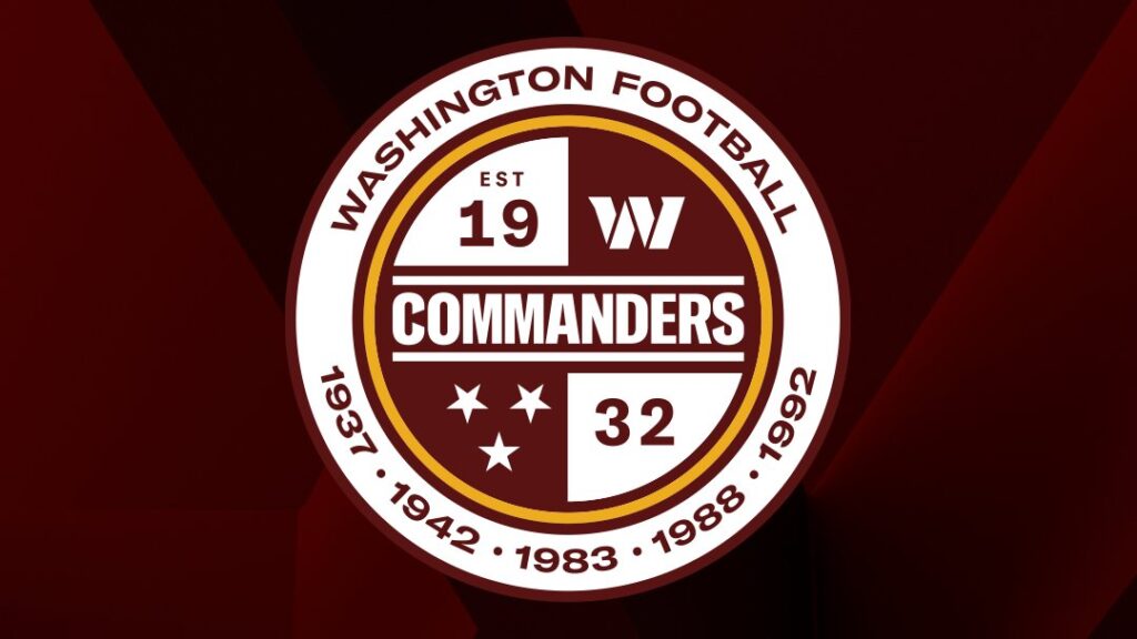
Next up is the new Washington Commanders Crest! That’s right! Jason Wright’s love for professional soccer. Well, I love European pro soccer, too. So, I love the idea of a team crest. And what a great-looking team crest, too. I love this design. I dig the circular design. The interior circle has the Washington Commanders word mark running through the middle.
We then get four quadrants. Two of the four quadrants have the “est. 1932” for the year of the franchise’s founding in Boston. We have the “W” primary logo. We also have three stars. Now, originally, in the leaked photos for this crest, we had the DC flag in this quadrant. I am unsure if these three stars are from the DC flag or if they are to represent the three Super Bowl victories.
I love that the Commanders worked in both their word mark and their primary logo into the crest. This is the type of consistent brand building that weaves all of the branding for the Commanders together in a cohesive fashion. However, what I do not like are the three stars. They are grouped together in a fashion that makes it look like the Tennessee state flag.
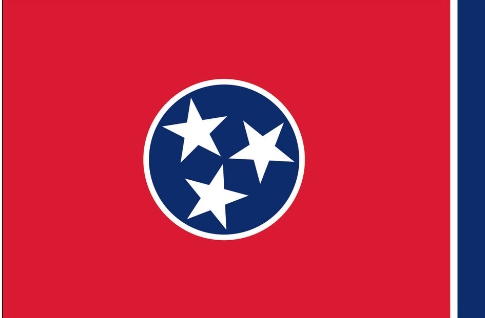
This is a huge design mistake and needs to be rectified. There is no reason to have anything on the Commanders seal that makes anyone think about Tennessee. It should be all about Washington, DC. The easiest solution is to go back to the leaked original design of the Commanders seal and simply have the DC flag in this quadrant.
I love the gold circle outlining the inner circle with the four quadrants. I dig the burgundy circle on the outside of the gold circle. This helps emphasize the importance of the Burgundy and Gold to the Washington franchise. We then have a ring of white with the words “Washington Football.”
I love that the team used Washington Football instead of Washington Commanders! This is fantastic and exactly what I hoped to see with this new branding. I wanted everything to be more Washington, DC-centric than Commanders-centric. Having Washington Football establishes the “Washington” part of the franchise’s name as the core aspect of the franchise’s identity. It also effectively connects the Commanders to the Football Team, the Redskins, and the Braves.
Now we get to the biggest problem that I have with the Commanders crest. The years of the Washington franchise’s championship teams. 1937 and 1942 are correct. But, the three Super Bowl championship teams are signified by the year in which the teams played the Super Bowls instead of the year of the NFL season. We all know that it is the 1982 Redskins, the 1987 Redskins, and the 1991 Redskins that won the Super Bowl. However, the team put the years that the Super Bowls were actually played. Nobody does this. Even the Washington Commanders website lists the Super Bowl championship teams as the 1982, 1987, and 1991 Redskins.
This is ridiculous. This is the type of sloppy work that has made the Washington franchise such a joke underneath Snyder’s ownership. The sad fact is that the Commanders do not have anyone in the franchise who actually knows the history of the team. This is also reflective of the usual sloppy and half-assed work that we come to expect from Washington’s executive team.
Jason Wright has said in interviews that they picked the years that they did because that is how the NFL record book lists the champion teams. That is a weak excuse for what was an obvious mistake. Absolutely nobody ever uses the year in which the Super Bowl was played as the year for the championship team. Nobody. It is the 1972 Dolphins that are always talked about as being the perfect team despite the Super Bowl being played in 1973. Nobody ever calls them the 1973 Dolphins.
This is a mistake that the Commanders have got to fix immediately. And I mean right now. There is no reason to wait. It makes the franchise look like a joke in the eyes of everyone else in the NFL.
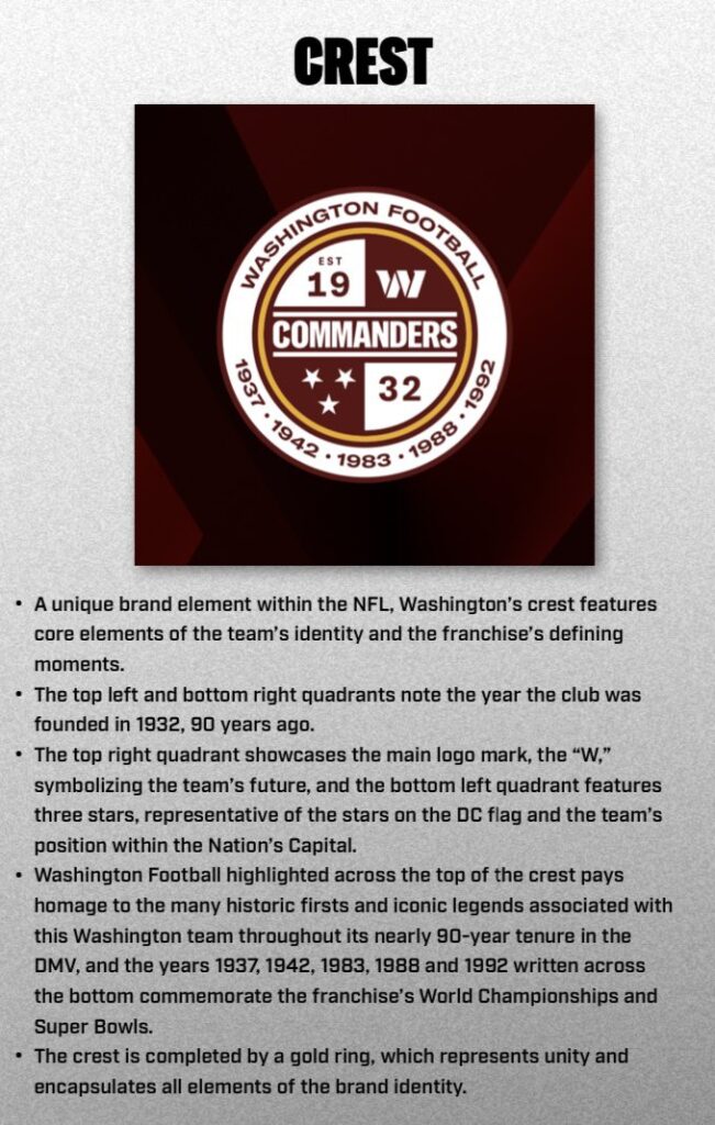
Oh, boy! We get more of that awesome mumbo-jumbo about the design language for the Commanders crest. The explanation does properly note that a crest is unique in the NFL. I have never heard of another team having a crest. I think it is fair to say that the crest embodies the core elements of the franchise’s history and identity. We also got confirmation that the three stars do in fact represent the DC flag. If that is the case then they need to change this ASAP and put the DC flag from the original crest back into the final crest. We are not from Tennessee!
We do see that the explanation for the championship years in the crest represents the World Championships and Super Bowls. I get it. The two World Championship games were actually played in 1937 and in 1942. And the Super Bowls were played in 1983, 1988, and 1992. I see where the team was trying to be consistent with the years that they used. However, using the regular season years works, too. I guess another alternative would be to simply use the Roman numerals for the three Super Bowl championships.
Hey! The gold ring represents unity and encapsulates all the elements of the brand identity! I never would have ever guessed that in a million years. I just thought the gold band was a cool way to get the Burgundy and Gold into the crest. Evidently, it also means unity! Why not?!
Final Grade: 5 out of 10. If the years and the stars are fixed? 10 out of 10.
All in all, I think the Washington Commanders did an average job with their new wordmark, primary logo, and team crest. Was everything perfect? No. And I was not expecting perfection. This is little Danny Snyder that we are talking about here, people. But, this was at least a better-than-expected effort. With a few tweaks to the team’s crest, I think the Commanders will be off to a pedestrian but at least a solid enough start with this new brand direction.
Leave a Reply