
The Washington Commanders dropped their new helmets and uniforms for the 2026 season today at 10:00 am in a rather succinct 1-minute and 6-second video. That’s it. No silly live reveal on the Today Show with poor Doug Williams and Jonathan Allen looking like hostages as Jason Wright lorded over the bungled event. Craig Melvin’s force “HAH-HAH!!!” when Doug Williams said the new name Commanders, still haunts me in my nightmares.
I was thrilled that the Josh Harris-led ownership group chose a subdued rollout of the new uniforms and helmets. Partly, because there was not much of a surprise in this reveal. And partly because it signals that the over-the-top silly way of doing business is done now that Snyder is gone.
We reviewed the hideous new Washington Commanders uniforms that were unveiled on 2.2.22. Needless to say, we gave the new uniforms low scores. None of them looked good. I guess that the burgundy uniforms were the least offensive of the three new uniforms. The biggest problem is that the odious new uniforms combined with the worst name in professional sports made it feel ike an expansion team had replaced our beloved Washington Redskins.
Anytime I watched the Commies play in any of their three awful-looking uniforms, I never felt like I was watching the team that I grew up rooting for and had loved my entire life. It was a shame considering that the Washington Redskins were one of the oldest teams in the NFL and had traditional uniforms that rarely underwent any real changes since 1978.
Then the Commies rolled out their new alternate Super Bowl Era uniforms in 2025. We reviewed them and gave the jersey and pants a 10/10 score. We gave the helmet a 7/10 score since the helmet was still matte paint and the wrong color, burgundy. Also, the helmet still had that dumb taco-holder W logo.
Fast forward to this morning at 10:00 am. This uniform and helmet reveal was largely anticlimactic because we already knew two of the three uniforms would be the white Super Bowl era uniforms from last season, plus a burgundy version of the Super Bowl era uniforms. The only “surprise” would be if the primary helmet got a new logo and if the black uniform and helmet would get changed. Oh yeah, Homage also screwed up and mistakenly posted an ugly sweatshirt with the new alternate logo for the Commies. As a result, the reveal this morning was less than exciting.
After the 1-minute new uniform reveal video was dropped on X, I turned to YouTube to see Fred Smoot, Santana Moss, Grant Paulson, and Doug Williams talk about the new uniforms and helmets. It was kind of sad to see how desperate these former Redskins were in trying to hype up fans who hate the name Commanders and hated the uniforms from 2.2.22 and hated the generic Clipart W logo. At one point, Doug Williams basically said that the name Commanders sucked, and we all know it.
It just hammered home how small the Washington football fanbase has become. This is why, even after a season where the Commies were one game away from the Super Bowl, they still could not sell out home games and had their home games routinely taken over by the opposing team’s fans. It is why, despite going to the NFC Championship game, the Commies still got terrible TV ratings for their games. It is why the Commies rank at the bottom in attendance in the NFL.
To be clear, Josh Harris and Company fully understand that they absolutely have a fan problem. And it is one that was not fixed by winning, like the small minority of fans who supported the name change claimed would happen. Part of the solution was for Josh Harris to get the Commies to look more like the Redskins. That was the point of today.
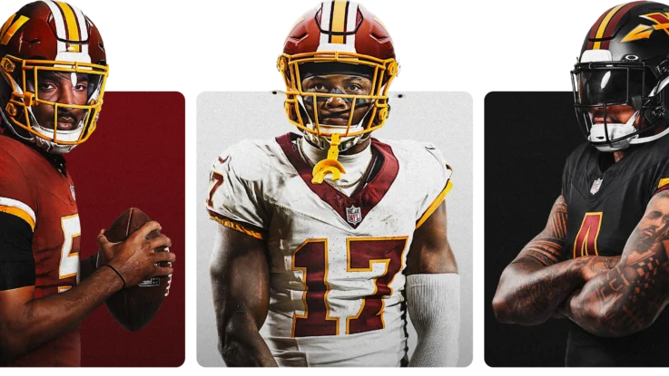
With all of that out of the way, let’s go ahead and judge these three uniforms and two helmets!
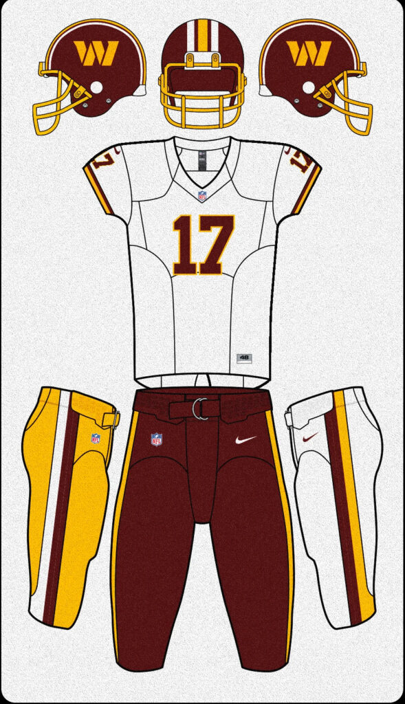
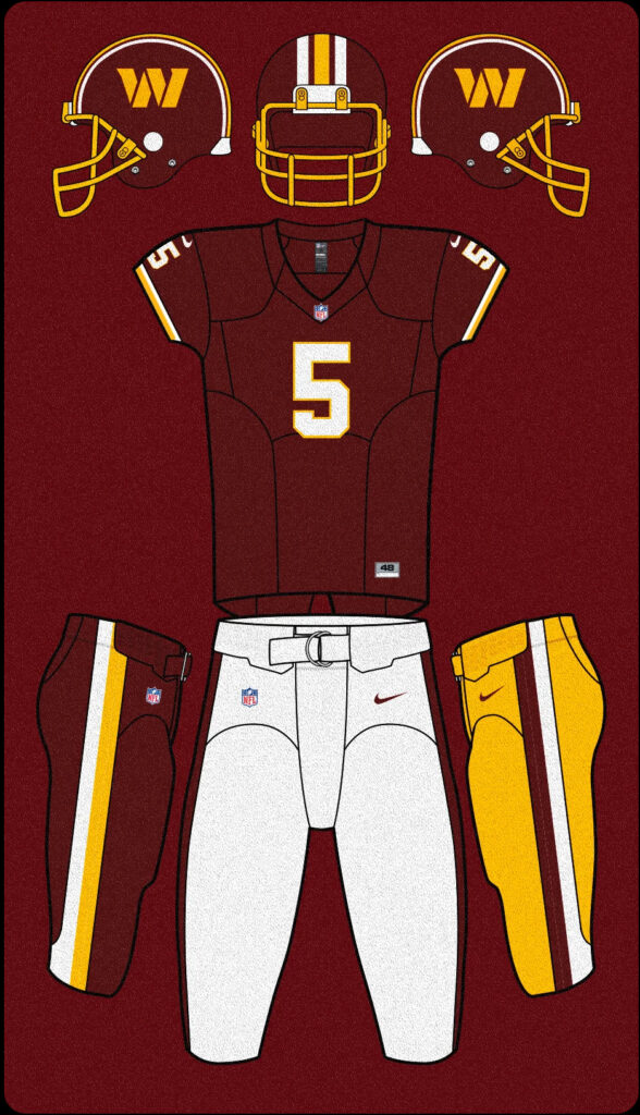
Washington Commanders Primary Helmet
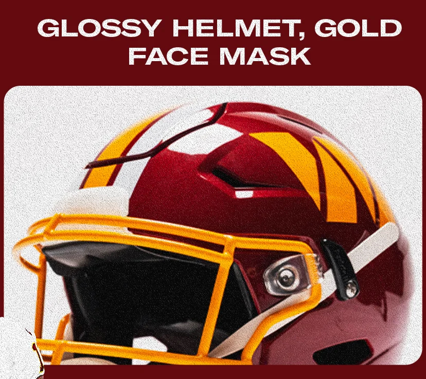
The Super Bowl Era alternates that the Commies wore last year did sport the classic Redskins center striping pattern and the gold facemask. However, the helmet was still matte paint and a different shade of red than the burgundy of the classic Redskins helmets. Well, that error was cleaned up with the new primary helmets.
These new primary helmets now sport the same gloss paint finish as the classic Redskins helmets. The color of burgundy on the helmet is also the proper color of burgundy of the classic Redskins. This helmet looks so damn nice! Combine the proper color burgundy and gloss paint with the classic Redskins center striping and the gold facemask, and you have a beautiful helmet that blows away the helmet that the Commanders rolled out on 2.2.22.
However, we do have our first swing-and-a-miss by Josh Harris and Company. For some reason, they kept that generic-looking taco holder W on the side of the helmet. The block W looks like generic Microsoft Clipart from the 1990s. It is awful. It looks like something your six-year-old did at the last minute. It lacks any design taste or style. It is just ugly and generic.
It is also the last aspect of the uniform that has the stench of Daniel Snyder dripping all over it. I honestly do not know anyone who likes this logo. It boggles the mind why Josh Harris and Company are so beholden to this piece of crap logo design.
Slapping the generic block W on the side of the classic Redskins helmet is like slapping a big, hairy mole on the side of Sofia Vargas’ face. It is a real fart in the elevator moment by the ownership group. Josh Harris and Company had the chance to do something amazing and put a spear on the side of this beautiful helmet. What a shame that they missed this obvious and easy win with the fans.
Helmet Score: 8 out of 10. The helmet the Commies wore with the Super Bowl Era uniforms scored a 7 out of 10 from me. I pushed it up to an 8 out of 10 due to the gloss paint and proper color of burgundy. If Josh Harris had done the right move and slapped a spear on the side of this helmet, then I would have given it a 10 out of 10.
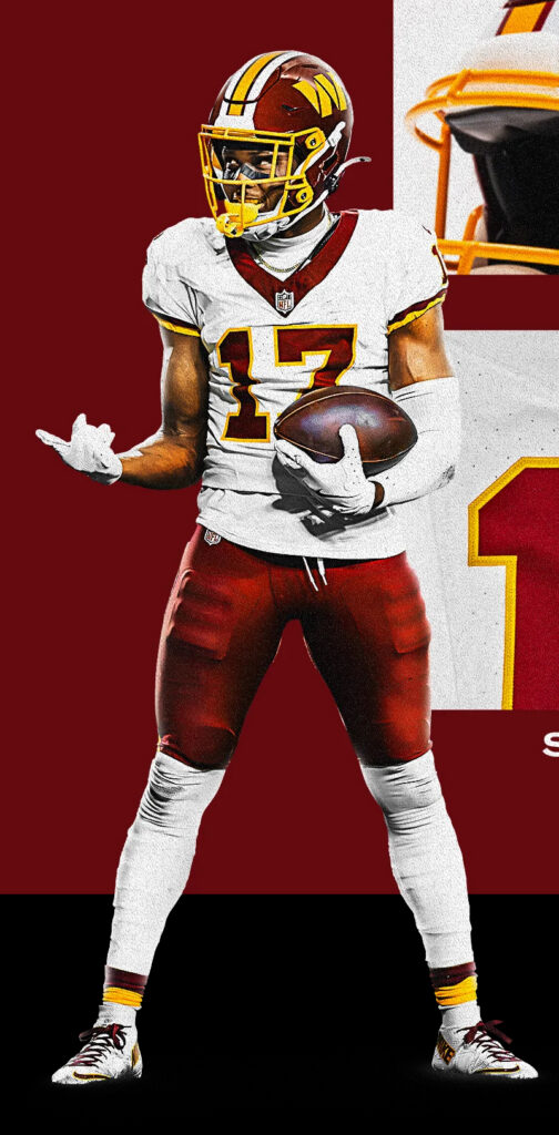
Washington Commanders White Primary Uniform
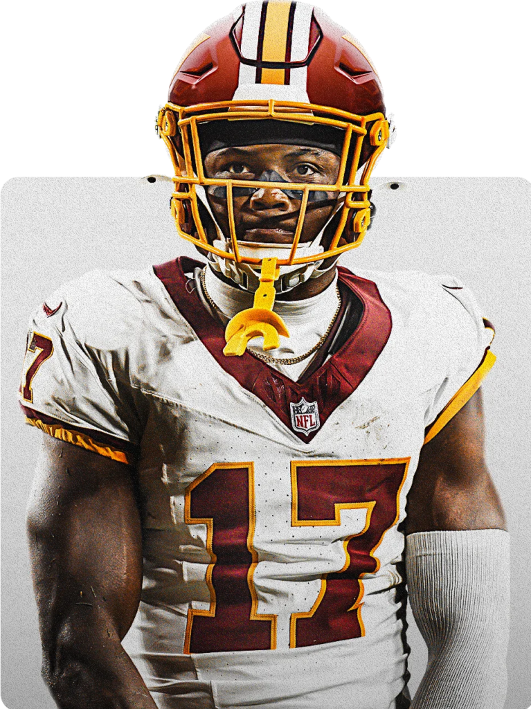
Mmmmmmm. Roll that beautiful bean footage! Yeah, we already know what this uniform looks like since we got it last year for three games. But, damn, just soak it in for a minute. Isn’t that white jersey so superior to that craptastic Louisville/Arizona State white jersey the Commies used to have? That jersey looks like the damn Redksins. And I LOVE that Josh Harris and Cimpany were smart not to soil this beautiful jersey with the name “Commanders” on it.
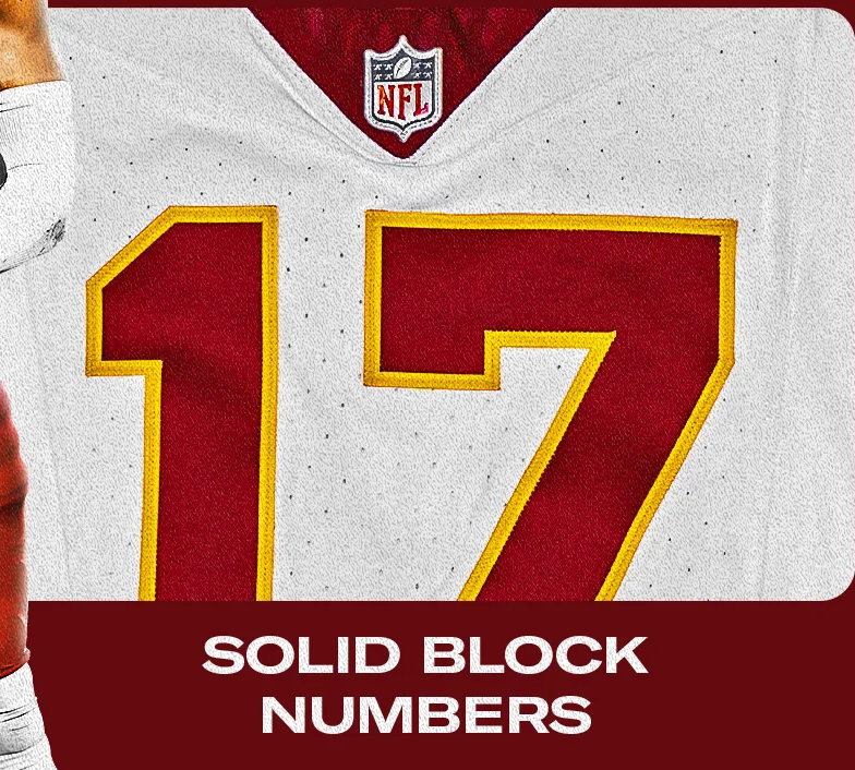
Again, nothing new, but I just want to take a moment to appreciate the gorgeous numbering on these jerseys. I love the strong block red numbers outlined in gold. This is so much better than those numbers on the Commies white jersey that were a pure abomination. Those pixilated and gradiated scarlet colored numbers outlined in black. Just hideous. And to make it worse, we had Jason Wright lecturing fans that the scarlet on those white jerseys was the classic Redskins burgundy color. Shut the hell up. The burgundy in these beautiful new white jerseys is the proper classic Redskins burgundy color!
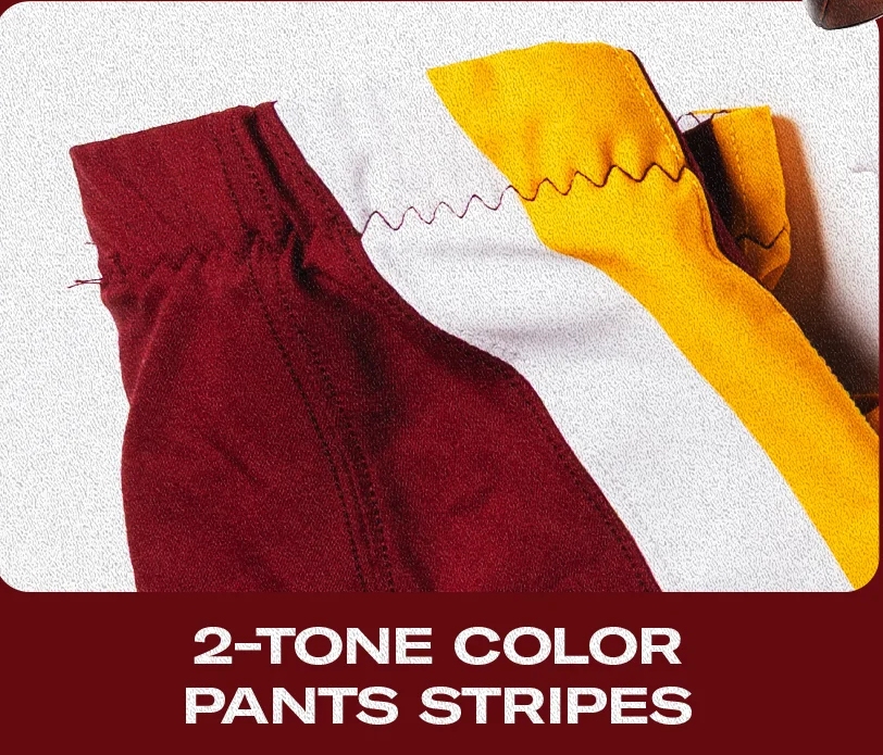
Again, nothing new to see here. We saw these beautiful pants last season. Just take the opportunity to soak them in again. Love the classic Redskins stripes on the sides of the pants. Nothing fancy or stupid like so many “modern” striping patterns you see some teams roll out these days.
Again, nothing new with this uniform. It is a classic beauty, and I am glad to see these white uniforms become our permanent white uniforms instead of what Jason Wright and company foisted on us.
All right, now is where it starts to get interesting with these white primary uniforms. We only saw them last year paired with the burgundy pants. Most people were predicting that the new uniforms for this upcoming season would only have white and burgundy pants since the Super Bowl era uniforms never had gold pants.
Well, Josh Harris did have a few surprises up his sleeve, as he said. One of those surprises is that the gold pants are part of the rotation with the new Super Bowl era uniforms! I love it! This gives the team multiple clean looks to rock with the white jerseys.
Of course, I love the classic white on burgundy looks. And I have always been a fan of the icy whites when the Redskins wore white pants with their white jerseys. However, the combination I am most excited to see is the white jerseys and the gold pants. This is something we have rarely seen. The last time we got this combination was back in 2018. It is a great look.
All three pairs of pants look fantastic. They all sport the appropriate striping patterns. It is pure perfection. Classic Redskins goodness.
Jersey Score: 10 out of 10. I gave these jerseys a perfect score when they were rolled out last year as the alternate jerseys. They will continue to get a perfect score from me every year that the Washington franchise wears them.
Pants Score: 10 out of 10. I loved the Super Bowl era burgundy pants last season. The addition of white pants and gold pants in the classic Redskins design is the cherry on top. There is nothing to complain about with these three sets of pants. They are fantastic.
Washington Commanders Burgundy Primary Uniform
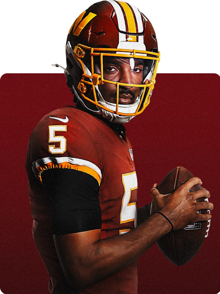
All right, now we get something brand new! We all knew that the burgundy versions of last year’s Super Bowl Era jerseys were headed our way. And how gorgeous they look! They are the same style as the white jerseys. These burgundy primary jerseys are straight from the 1980s and 1990s, when the Redskins were winning Super Bowls. Again, the proper block number font is beautiful. I love the clean white numbers outlined in gold.
I also appreciate that, like the white primary jerseys, the burgundy primary jerseys sport the proper burgundy and gold coloring of the Redskins that we all know and love. That’s right, no more being lectured to by Jason Wright that we were simply “seeing” the colors wrong and that the new Commanders uniforms were the classic burgundy and gold colors of the Redskins. They never were. This burgundy primary jersey? Yeah, that is the proper burgundy and gold of the Redskins!
Also, it is important to note that just like with the white primary jerseys, the name Commanders does not appear anywhere at all on the burgundy primary jerseys. This is a smart move. Look, Josh Harris and Company know the name Commanders sucks. And they are doing what they can to minimize that awful and unpopular name.
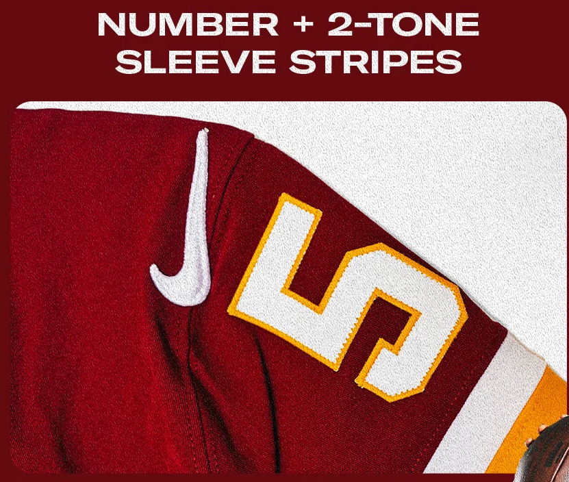
Like the white primary jerseys, the burgundy primary jerseys have the proper block numbering on the sleeves. We also get the proper striping pattern of the old classic Redskins jerseys. Honestly, these burgundy jerseys are perfection. There is literally nothing to complain about at all.
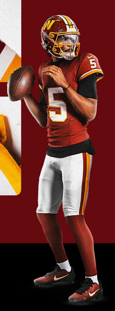
Bask in the beauty that is the burgundy primary uniforms. Paired with the white pants, and you have the classic Redskins look that we all knew and loved when Joe Gibbs was winning Super Bowls.
Just like with the white primary jerseys, the burgundy primary jerseys will be paired with either the traditional white pants or with the gold or burgundy pants. While I adore the white jersey with any of the three colored pants, I am not that way about the burgundy jerseys. Personally, I would only pair the burgundy jerseys with the white or gold pants. Pairing the burgundy jerseys with the burgundy pants is hideous and will make the players look like bottles of ketchup on the field. Nobody needs that.
Jersey Score: 10 out of 10.
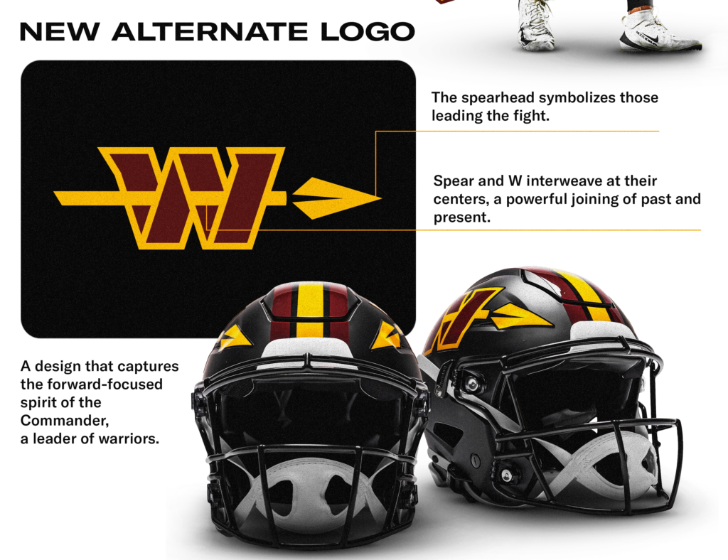
Washington Commanders Black Alternate “Hail Raiser” Helmet
Hell yeah! Now this is a beautiful alternate helmet. We killed the Commies back on 2.2.22, when the Commies rolled out those hideous black alternate helmets with the stupid block W logo on the forehead. What an awful helmet design. Well, Josh Harris and Company show how you do a proper alternate helmet.
The Hail Raiser helmet is gorgeous. I love the black matte finish. While I firmly believe that the Washington franchise should always rock a gloss paint on their primary helmets, I am open to being creative when it comes to an alternate helmet. This is the time when you try something like a matte finish.
The matte finish on the black helmet gives it a badass stealth vibe. I adore the center triple stripe that mimics the classic triple stripe on the primary helmet. It is beautiful. Switching up the facemask from gold to black was a smart move and continues the stealth vibe of this uniform.
And then we get the other surprise that Josh Harris mentioned he had up his sleeve. The spear is back, baby! Unfortunately, the block W is back, too. The spear looks so damn cool from either the side view or the front view of the helmet. But that lame block W is a real turd in the punchbowl.
This is especially disappointing considering some of the genuinely cool-looking mockups that we got from fans before the uniform reveal that showed what a black helmet with the spear on the side of it would look like. Those mockups looked so cool!
Now, having said that, the W logo with a spear through it is a superior logo than the block W logo. But, that is not saying much as nearly anything would be an improvement over the block W logo.
Helmet Score: 9 out of 10. The Hail Raiser helmet is badass. No doubt about it. And the Spear W logo is a better logo. But Josh Harris and Company screwed up such an easy win here by not going with just a spear. I would have definitely given this helmet a 10 out of 10 score if it had just the spear logo on the side.
Washington Commanders Black Alternate Uniform
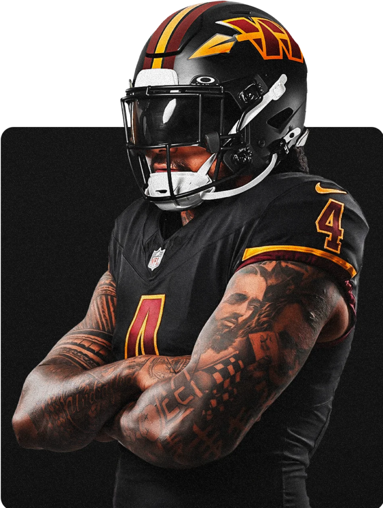
Look, I am going to be honest. I do not like black for black’s sake uniforms. They just don’t do much for me. Having said that, these Hail Raiser jerseys are fire. The black jerseys that the Commies rolled out on 2.2.22 were trash. They had a weird skinny font for the numbers. They employed the Pittsburgh Steelers’ black and gold color scheme. They had Commanders written on the front. They were just hideous.
The Hail Raiser jerseys? Fantastic. They are just the classic Redskins white primary jersey, but colored black. Sticking with the simple classic design gives these alternates a clean and sleek look. Also, the burgundy and gold on the jerseys pop and look incredible.
It should also be noted that just like the white and burgundy primary jerseys, the Hail Raiser jersey does not say Commanders anywhere on it, either. Smart move.
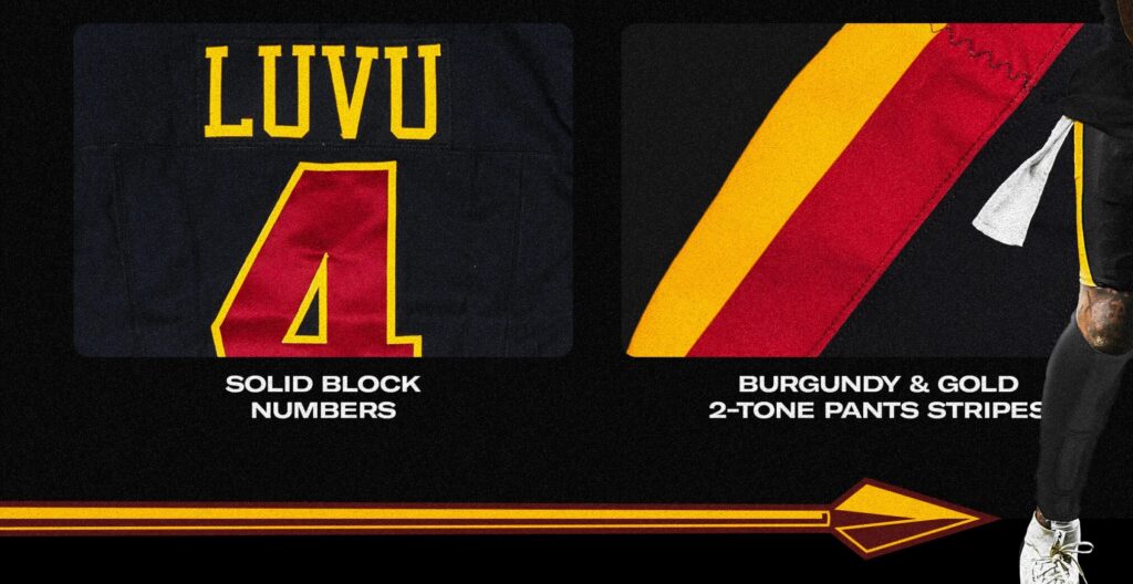
The striping on the Hail Raiser pants perfectly mimics the classic stripe pattern of the white pants. Brilliant move. It is a clean design that looks incredible.
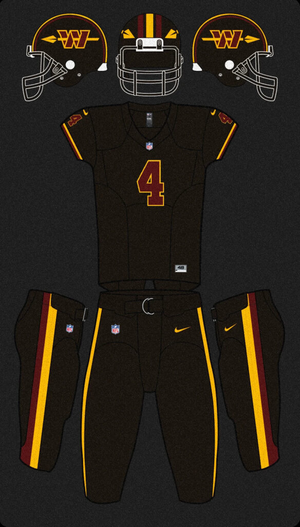
Unlike the primary jerseys, the Hail Raiser uniform only comes with one pair of pants. That is a smart idea. The black jersey looks much better with black pants than with any of the other possible color combinations. The all-black look with the classic design elements from the primary uniforms makes the Hail Raiser look sleek. I cannot wait to see the Commies take the field in the Hail Raisers.
Overall
Josh Harris and Company deserve a ton of credit for the new uniform rollout. They did a far superior job than Jason Wright and his cronies did on 2.2.22. The Commies now look like the Redskins. Plus, they have a dope new alternate uniform that is a massive upgrade from their black Wario alternates.
What I appreciate the most is the amount of professionalism that Josh Harris and Company have brought to the franchise. This new uniform unveiling is a shining example of that. Harris and his group understand the mission and try their best to deliver something that will make the fans happy.
Looking at the three new uniforms as a set, what I love is that it is that Harris and Company approached these new uniforms with a clearly defined design language that runs through all three uniforms. One of the biggest criticisms of the three uniforms rolled out on 2.2.22 was that the three uniforms looked like they were designed by three seperate teams who were siloed off from each other during the design process. There was no common design language or theme that ran through the three uniforms.
That is not the case with these new uniforms. The white primary uniform, the burgundy primary uniform, and the Hail Raiser alternate uniform all share a common design DNA. That makes the uniform set look cohesive and pleasing.
All in all, I am thrilled with these new uniforms and cannot wait to see the Commies take the field in all the various combinations we will get during the year.
Leave a Reply